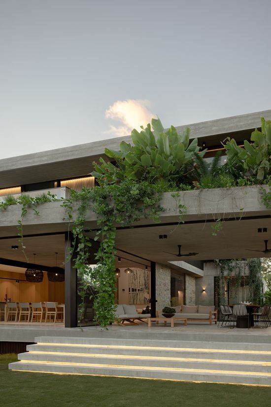
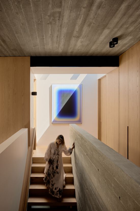
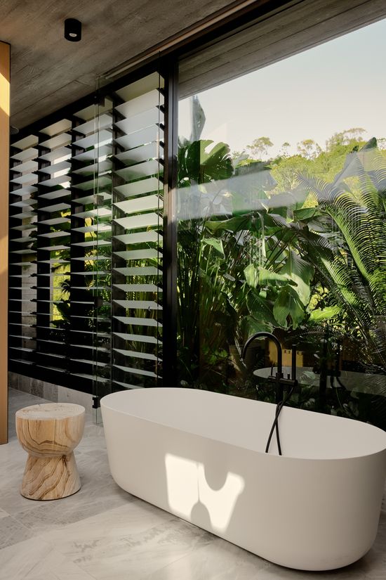
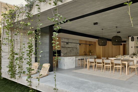
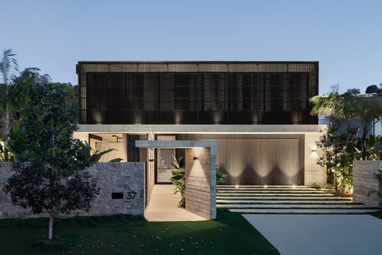
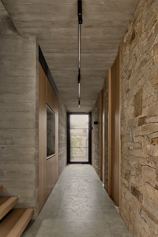
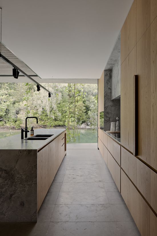
An amalgamation of architecture, building and interior design, Witta Circle is a breathtaking property.

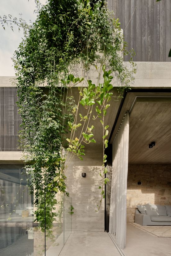
Hong Henwood, Witta Circle is a dream home. The beautiful décor. High ceilings. Soft tones. Natural feel. Each room effortlessly links into the next. It’s modern, elegantly styled and so homely and inviting. And then there’s the greenery cascading down from above. And the stunning vista… Be honest, how excited were you to take on this project?
After previously working with this client on a property in Singapore, when they heard I’d moved to Noosa and they had bought a house there, it was just perfect timing. I was really excited to work on this project! The home turned out fantastic, so it was great to be a part of it.
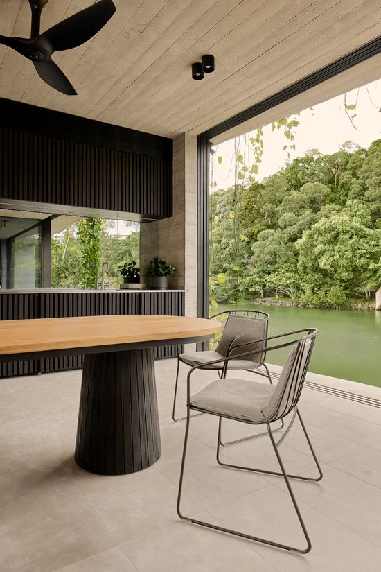
"We wanted to match the interiors to the elements outside – the water and the garden. We wanted to keep it light. Natural. Airy. Very minimal."

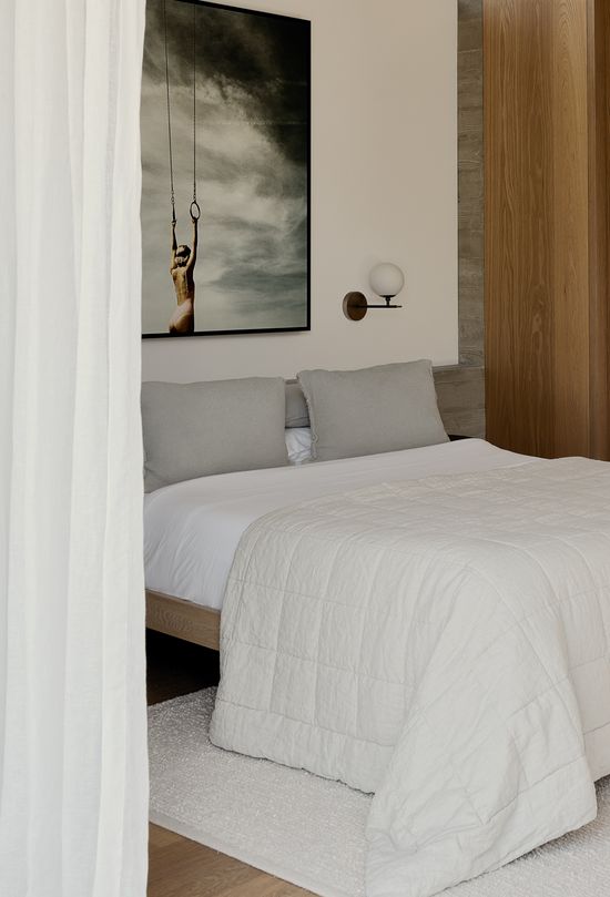
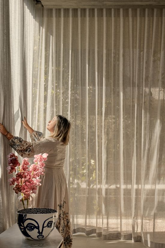
Hong chose to utilise sheer curtains from our Allusion range in colour Limestone.
What was the initial brief like for Witta Circle and how much collaboration goes into a big project like this, so you can achieve the perfect look?
This project took a year to complete. We started with all the architectural plans and built it up from there. The brief was to keep everything minimal. Not too many cushions or anything like that – often cushions are overused by designers to make everything look “soft”, but it can make a house cluttered. That wasn’t what we wanted here.
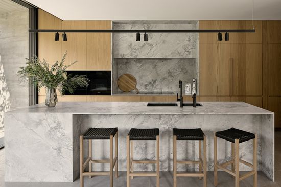
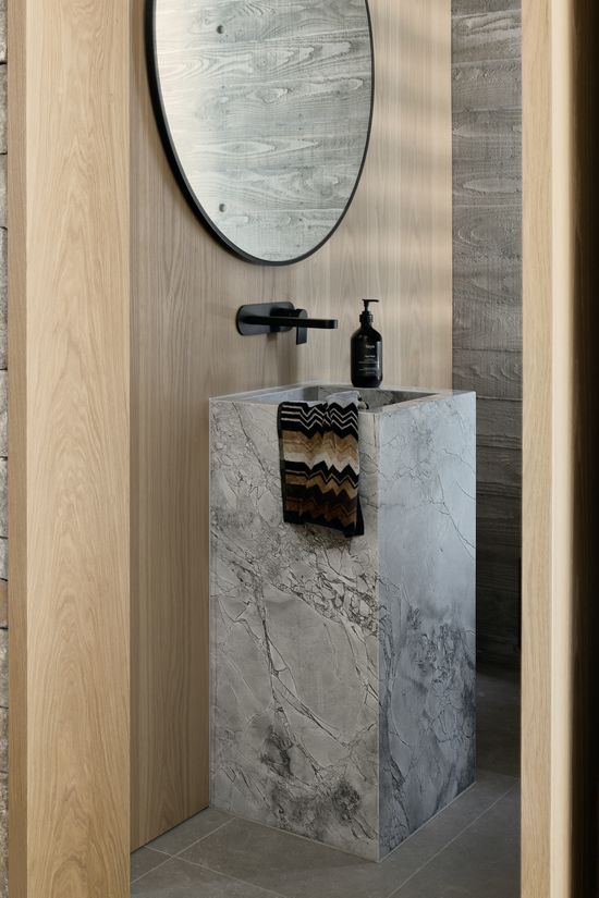
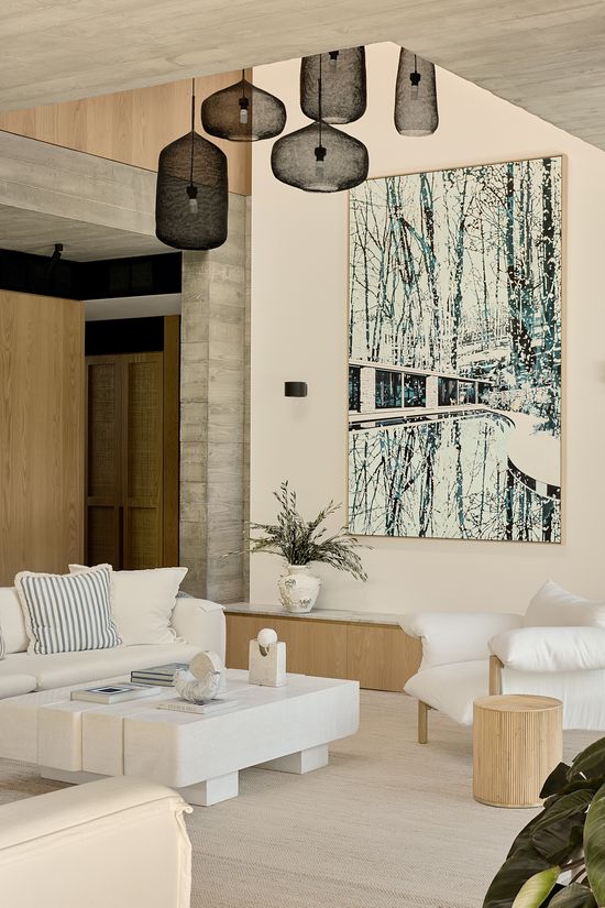
We wanted to match the interiors to the elements outside – the water and the garden. We wanted to keep it light. Natural. Airy. Very minimal. We wanted minimal furniture and made choices based on creating contrast against the main material, concrete. So, we chose fabrics that were natural, allowing the décor to complement the natural environment. We wanted to let the amazing architecture speak for itself.

"The linen-look was perfect, it matched well with the colour of the walls, all the elements of the room and was consistent with the idea of keeping everything light, natural, and airy."
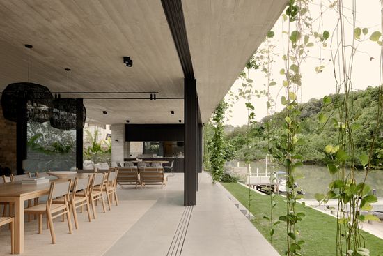
The open, indoor/outdoor living is such an amazing feature of this property. Then, of course, being able to close off spaces is so integral. From an Interior Designer’s perspective, why were sheer curtains from our Allusion range the right choice to be incorporated in certain spaces? And talk us through choosing to utilise motorisation or not?
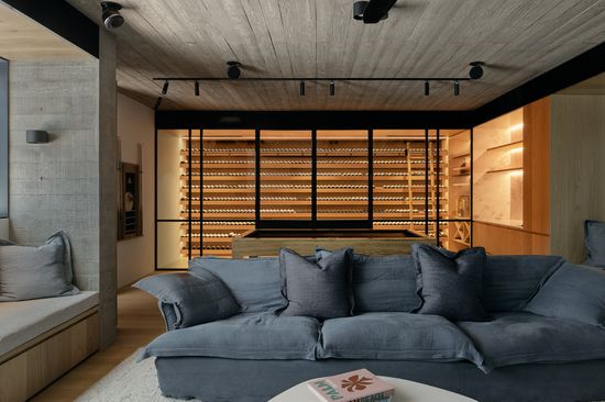
We chose double sheer curtains in the media room because the texture and the flexibility of filtering the right light was so important. It means you don’t get the sun’s glare on the TV screen, but it also doesn’t take away from the view out to the pool. The linen-look was perfect, it matched well with the colour of the walls, all the elements of the room and was consistent with the idea of keeping everything light, natural, and airy.
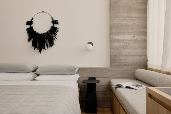
We motorised the master bedroom for convenience but didn’t with the media room, as the client didn’t want too much automation for the kids!

The style is so earthy with lots of wood, stone, and greenery - parts of the house look like a modern-day oasis! How do you go about finding inspiration, creating a theme, and tracking down the ideal pieces that complement the architecture?
As an Interior Designer, I’m involved from the very beginning. So, what we do is we work with the architect and then meet with the client to get a clear idea of what they want. Then we start to go to shops, pick out pieces and render a 3D version of the home, so they can see how the couch will match with the rug for example. From there, there’s a lot of back and forth, but that’s just so we can create the perfect look.
With Witta Circle, we didn’t want to mess with the architecture, so we paired it back. Nothing is over-the-top. Nothing is invasive or too jarring. It’s clean. It’s neat. It’s modern. Obviously, we don’t want to surprise anyone with any bold choices, we want to ensure that our clients are happy when they walk through the door.
"Sheers were utilised to filter light nicely and created the perfect amount of texture."
Obviously, the warmer climate plays a big role in the layout and style of this project. Are there any practical design aspects that you had to think about in terms of how the weather there might affect living at Witta Circle?
The front façade of the house was equipped with an external screen that was able to provide protection from the heat and provided privacy, where the sheers were utilised to filter light nicely and created the perfect amount of texture. In the bedrooms, we doubled-up with blockouts, as they’re ideal to make it dark at night-time for sleeping, plus will help keep the rooms cool.

"That first moment, when they opened the door and started running from room to room – it was amazing. The squeals from the kids. The delight. Their reactions. That’s the most satisfying part for me."
The design is wonderful with such purpose in how every space feels creative, open yet intimate and completely liveable at the same time. We just love so many different aspects about this home but what was it about the finished product that you found to be the most satisfying?
We often style homes that aren’t lived in by the clients. It’s a really special feeling when they come and see it for the first time. This project was set up for Christmas, so we had a Christmas tree up and everything. That first moment, when they opened the door and started running from room to room – it was amazing. The squeals from the kids. The delight. Their reactions. That’s the most satisfying part for me.

Hong, we love your style so much. We love what you achieved with Witta Circle. How can we see what you’re up to and have you got any other projects in the future that are going to be as amazing as this one? We can’t wait to see more!
You can follow me on Instagram @honghenwooddesign and we have started a new company, Archend - you can find out more about us at archend.co. This new business allows us to be involved from start to finish. From construction to building and interior design. We have some big projects coming up, plus another with architect Shaun Lockyer who we worked with on Witta Circle.
I feel like we’re fully booked for the next few years but I seem to keep taking more on!?




Have a question? We’re here to help
1300 918 390
Mon to Fri 9am - 5pm


